
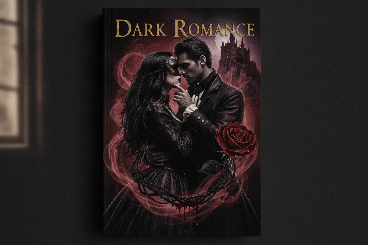
Cover design plays a huge role in how dark romance is perceived, especially online where readers often judge a book in seconds. For RC Wilde, the cover should communicate mood before a single word is read. That means using imagery, color, and typography that hint at danger, passion, and emotional intensity while still feeling polished and professional.
Readers of the genre tend to look for strong visual cues. Dark palettes, dramatic contrast, and expressive character imagery can all help signal the story’s tone. At the same time, the cover needs to remain legible and attractive at thumbnail size, since many readers first encounter books on mobile screens, retailer pages, or social media posts.
On the website, cover art deserves space to breathe. A dedicated books page with large, clear images helps each title stand out and gives readers a more immersive browsing experience. When the visuals are cohesive across the series or catalog, the author’s brand becomes stronger and easier to remember.
Good cover design does more than attract attention. It sets expectations and helps the right readers find the right story. For dark romance, that means promising heat, tension, and depth in a single glance. When the cover aligns with the blurb, the writing, and the brand voice, the result feels complete and compelling from the very first impression.
Leave a Reply